Showing posts with label Digipak. Show all posts

Thursday, 13 February 2014

CD

I wasn't able to make the actual Digipak because I didn't have the adequate material to so I decided to make a Cd cover instead.


Saturday, 18 January 2014

FRONT COVER ‡ FINAL DRAFT ‡


During the feedback in class, Jack pointed out the front cover was a bit flat so I decided to add some stroke effect to both the picture and the name of the band. This made the band name more visible.

Friday, 17 January 2014

INNER PANEL ‡ 4 ‡

I decided to change the inner panel from the T shirt promo this because free merch giveaway seamed like something that should be in a small conner in the digipak and not part of the whole panel.
I decided to change it to a picture of the band members but designed it to fit the rest of the digipak designs.

Friday, 10 January 2014

INNER PANEL DISCARDED!


This was going to be used as part of my inner panel but after showing it to the teacher and other students, they said that it glorifies suicide and that is something I don't want my video to be associated with.
The picture and the text beside it is not something that should be used for an A level project so I decided to change but still stick to the stereotypical conventions of my genre.
I also changed it to fit something that I call, 'my definition of "emo" genre'

TRACKLIST 2ND DRAFT


Thursday, 9 January 2014

CD DESIGN CHIOCE


CD DESIGNS


These 3 designs fit perfectly with the new idea for my digipak because they are all in a grunge style. 
I decided to chose the middle one because it was more of a fit and the font and the grunge design was a perfect mach.

I also printed them out and showed to the people I felt were my target audience and 95%of them chose the middle CD design. 

Tuesday, 7 January 2014

POSTER ANALYSIS OF A BAND SIMILAR TO MINE


I chose this poster because because it is similar to what I want to do with mine. The picture of the all the band member is important for my poster because my band is an upcoming band. The choice of costume and font is also going to be of my major focus when making my poster because it will help my target audience recognise the genre of music my band plays.
The costume worn by the band members of Black Veil Brides makes them easily recognisable by their target audience and that is why I chose this particular poster.

Another reason I chose this poster is because it has the name of the band boldly written at the top. The front cover of the album is shown in the poster to indicate that the poster is a mean of advertising their new album. That will also be one of my major focus when creating my poster.
The poster will be gotten free if the album is bought and that will make the target audience want to buy their album. This is a means of marketing that I want to add to my poster.

Wednesday, 30 October 2013

FEEDBACK FOR DIGIPAK PRESENTATION

After presenting my digipak to the class I got various feedbacks from them.

They said that they like the idea of the digipak telling a story and the track listing.
They also like the setting used in the digipak because it goes well with the genre of my music.
They liked the black and white effect and the fact that there was a reoccurring theme across the digipak.

They suggested that I change the font because they could hardly read it. They also said that the picture used in the inner panel (the bloody hands) is too graphic.

 This is something I really likes because it provoked a strong response from the audience and that is what I want my music video and digipak to do.

They also said that I need more variety of pictures because I had one picture on both sides of the inner panel. They also suggest that I re shoot the picture for the front cover because the one I have is too blurry. 

I decided to take more photos in the day and edit them on Photoshop because the one I had was taken in the night and might have added to the reason why it wasn't very clear.

Tuesday, 15 October 2013

FIRST DRAFT INNER PANEL

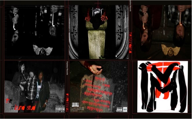
The inner panel is like a story. The two ends are of people holding the candles and the middle picture is a of someone with a bloody hand. The inner panel is like a continuity of the front cover, The front cover is a picture of the band and the inner panel is also of the band but it shows more about the band than the front cover. It gives the fans a medium that they can use to relate to the band.


Monday, 14 October 2013

FIRST DRAFT OF FRONT COVER

The front cover is of me and my band. The picture is in black and white and I am the only one in colour. I did this to emphasise that I am the only one that is real and everything else is just my imagination. This idea will be seen in the music video. 
I did it this way because I want my audience to connect with the band in a deeper way especially as it is a new band.


Friday, 11 October 2013

FISRT DRAFT OF TRACK LIST

This is the first draft of my track list, when I finish the first draft of the digipak I will then do some audience research and see if the digipak appeals to my target audience.

The track list is on a tomb stone with bloody hands on the top of it. The track are written in a bloody font. This track list is similar to the digipak. The theme across the digipak is "graveyard".