Monday, 9 December 2013

JOURNAL ENTRY

This week I'm going to find a location for the 2nd photo shoot for my Digipak and Poster. I decided that I wanted to make the location inside in a practice room but I changed my mind and I might stick to shooting it in a grave yard so that it goes with the theme for the rest of the digipak.
The poster however might be done indoors because I want it to be different but not to different to my Digipak.
I decided to take the picture both inside and in a graveyard for my digipak and poster, edit them on photoshop and then decide which one suits it better.

Monday, 18 November 2013

MUSIC VIDEO FEEDBACK


Leanne gave me some feedback on my ideas for my music video. I decided to change a lot of things in my storyboard because I realised that the music I initially chose did not match the genre of music. 
She also said that there are somethings that I couldn't show in the music video because it may look like I want to glorify suicide or self harm. She said that I should change the ending so that the character doesn't die. I then decided to make the character live and tackle the idea of suicidal thoughts by making her write a suicide letter and at the end of  the video crumbling it up.

When I was adding that to my storyboard I decided that I didn't want it to be like a fairy tale and have a happing ending. So I decided that she wouldn't kill her self but she will crumble the suicide note and attempt to throw it in threw bin but it will fall of the bin and roll under her bed. That way the problem os still there but the character didn't kill herself and that opens her up to seek help for that problem instead of hiding it or throwing it away.

Thursday, 14 November 2013

COSTUME IDEA FOR MUSIC VIDEO (EMO THEMED)


Friday, 8 November 2013

JOURNAL ENTRY

Today we were asked by Leanne to complete our storyboard by the end of the week and create an animatic to it. We were also asked to have them completed by the next lesson so that we will present them in class and the rest of the class can give us feedback to whether or not the timing we used for each scene is good and whether it is not too long.
I completed my story board because I already started it during the half term.

Tuesday, 5 November 2013

LYRIC ANOTATION

I annotated the lyric for the song so that it can be expressed through the music video more accurately and more meaningful to me as an artist and my target audience.


Wednesday, 30 October 2013

FEEDBACK FOR DIGIPAK PRESENTATION

After presenting my digipak to the class I got various feedbacks from them.

They said that they like the idea of the digipak telling a story and the track listing.
They also like the setting used in the digipak because it goes well with the genre of my music.
They liked the black and white effect and the fact that there was a reoccurring theme across the digipak.

They suggested that I change the font because they could hardly read it. They also said that the picture used in the inner panel (the bloody hands) is too graphic.

 This is something I really likes because it provoked a strong response from the audience and that is what I want my music video and digipak to do.

They also said that I need more variety of pictures because I had one picture on both sides of the inner panel. They also suggest that I re shoot the picture for the front cover because the one I have is too blurry. 

I decided to take more photos in the day and edit them on Photoshop because the one I had was taken in the night and might have added to the reason why it wasn't very clear.

Friday, 25 October 2013

FEEDBACK ON PITCH FOR MUSIC VIDEO

The feedback shows that the record label and the song choice is a good fit for the music video. They also said that I used detailed audience research in my preparation and I showed how that affected my music video. They also said that I should state that my target audience is a niche audience.
They said that the narrative of the music video was good and the history of the band was very believable. 

However, there was some concerns. They said that I should check what the law says on showing self harm in a music video because they felt it might promote self harm. They were also concerned with that age of my target audience (14-22) because they felt that 14 was too young to be stereotyped as emo. 
I did some more research and found out that there were indeed some 14 year olds that are stereotyped as emo, although they are very few. This also feeds into my idea of the niche audience.


Wednesday, 23 October 2013

PITCH FOR MUSIC VIDEO

MUSIC VIDEO IDEA

This animatic video shows elements that will be portrayed in my music video.


Tuesday, 15 October 2013

FIRST DRAFT INNER PANEL

The inner panel is like a story. The two ends are of people holding the candles and the middle picture is a of someone with a bloody hand. The inner panel is like a continuity of the front cover, The front cover is a picture of the band and the inner panel is also of the band but it shows more about the band than the front cover. It gives the fans a medium that they can use to relate to the band.


Monday, 14 October 2013

FIRST DRAFT OF FRONT COVER

The front cover is of me and my band. The picture is in black and white and I am the only one in colour. I did this to emphasise that I am the only one that is real and everything else is just my imagination. This idea will be seen in the music video. 
I did it this way because I want my audience to connect with the band in a deeper way especially as it is a new band.


Friday, 11 October 2013

FISRT DRAFT OF TRACK LIST

This is the first draft of my track list, when I finish the first draft of the digipak I will then do some audience research and see if the digipak appeals to my target audience.

The track list is on a tomb stone with bloody hands on the top of it. The track are written in a bloody font. This track list is similar to the digipak. The theme across the digipak is "graveyard".

JOURNAL ENTRY

Today in sinead's lesson we continued on our digipak.  We were suppose to use this lesson to plan when we are going to do the photo shoot but I have already done my photo shoot so I started making my digipak in this lesson.
I stared with my track list and I finished the first draft in the lesson.

Thursday, 10 October 2013

BLOG FEEDBACK

In our lesson Leanne went through out blogs and gave us feedback.
She said my blog was good but I should add some explanation to them so that when it is being read the audience will know why and how it will relate to my music video or my genre.

Wednesday, 9 October 2013

DIGIPK IDEAS

This is my idea for my digipak. I want it to be funeral themed and the genre of music to come across through the digipak.
The front cover will be a picture of me and my band mates in a graveyard. The picture will be in colour but my band mates will be in black and white. This will convey the idea of hallucination and show that something is not real.
The track list will be on a tomb stone with a bloody hand and blood dripping from the hand.
The band logo will be on the cd and it will be like a puzzle piece. The cd will complete the band logo and when the cd is taken out there will be a picture of me and my band mates.
The spine will have my band name, the record label and everything that is suppose to be on a typical digipak spine.
The digipak tells a story because when you open it it reveals a picture of me soaked in blood screaming and there are candles everywhere. That scene will be in a church and that goes with the funeral theme. There will be people holding candles on the other sides but it will be in a dark lighting and their silhouette or  a very dark picture o f them will be seen.
That entire scene goes from light to dark.
The people wearing black, holding the candles and the Church scene goes well with my theme , funeral.


JOURNAL ENTRY

Today in Sinead's lesson we were asked to make a plan on how we want our digipak to look like. We were told that even if we work in a group the way we arrange our digipak will be different. 
We had to draw the design on a paper that we folded to look like a digipak and we were to explore different ideas and designs and also the diferent theme we want for our digipak. 
I decided that I want my to be funeral themed.

I was also told to play around with my band logo and see what I can create to make it look better that it is.

Monday, 7 October 2013

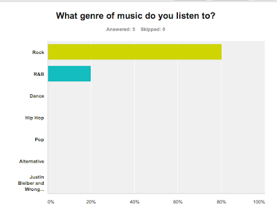
AUDIENCE RESEARCH ANSWERS

This a result of the questionnaire I posted on Facebook so that my target audience will fill out and I will see if it matches the stereotypical views of the genre.
The result shows that I an on the right track and my audience profile music choice and mood board matches the stereotypical emo genre.


Friday, 4 October 2013

AUDIENCE RESEARCH (MUSIC VIDEO)

In order to make sure that I created an accurate audience profile I did some audience research and as part of my audience research I created a questionnaire that I gave to my target audience.
When I get the result from the questionnaire I would then know if it matches my target audience, and if by any chance it doesn't, I will then know what I need to change for it to suit my target audience perfectly.
Create your free online surveys with SurveyMonkey , the world's leading questionnaire tool.

AUDIENCE PROFILE


I created an audience profile for my target audience. It consists of the things I feel my target audience are interested in and their stereotypical demographics and psychographics.
I also created a questionnaire that will be handed out to my target audience to see if they fit into my Psychographics and demographics.

Thursday, 3 October 2013

JOURNAL ENTRY

This week we started making our audience profile and we where asked to start planning our audience research over the weekend. The audience profile should include a questionnaire, interview of audiences that will fit into your audience profile and that research should be acted on by the next lesson. We also completed our digipak analysis and conclusion in Sinead's lesson and we did the green screen analysis.

GREEN SCREEN ANALYSIS OF DIGIPAK


The green screen analysis was for the band Ce Digest and the video is of a poor quality because the day I filmed it i was wearing green and I didn't realise that till I was editing and found out that I couldn't edit it well because it will cut some part of me off. So I decided to edit it leaving some of the green on so that I will fully show in the video.

Tuesday, 1 October 2013

DIGIPAK ANALYSIS OF OTHER BANDS SIMILAR GENRE TO MINE

OTHER INTERESTING DIGIPAKS

KESHA (Cannibal album)


This digipak is from Kesha's cannibal album and I chose it because I felt it was done in the true image of the artist. The front cover of the digipak had Kesha's face slipt in a design like it is sewn on. The two pictures are different and but they are put together gruesomely and that conveys they idea of the album and it also corresponds top the music the album is based on, "Cannibal".


DISTORTURE


This digipak has the same theme through out and it is very simple in how it is dome. The picture of the band is not shown and this I feel is why the album is targeted for fans only. The bloody theme is not very well portrayed through out the album but that is not what the band is bout and if someone who is not a fan sees this they wouldn't be able to tell what type of music the band does and that is something I wouldn't want to incorporate in my digipak.


CEDIGEST


This digipak is a very good example of how I want my digipak to look like. There is no picture of the band members on the digipak and this shows how they are marketing the digipk and how it is just for their core fans. There is a similar theme across the digipak and that theme follows the codes and conventions of emo rock. If someone who is not a fan of the band or has never even heard of the band sees this digipak they will have an idea of what type of band they are and what genre of music they do.


ENSLAVED (Vertebre album)


This digipak has a similar theme and the picture of the band members are shown but the lighting used in very low. This digipak conveys the genre of the music very well and non fans will be able to tell what genre of music this is from looking at the digipak. Although this is very well done it is still a bit normal, there is no wow factor and that is something I want to do to mine.


A DAY TO REMEMBER


This is very graphic and when it opens fully, the pictures are like puzzle pieces, when put together they form one big picture. I chose this digipak because I felt it had a unique aspect of it (the pictures as puzzles) and that is something I want to do to mine, not necessarily puzzles by making mine have an wow factor.

CONVENTIONAL ELEMENT AND INNOVATIVE IDEA (DIGIPAK CONCLUSION)

The digipaks that I looked which were of the same genre to mine had continuity in the them and they all had elements in it that follows the codes and conventions of rock. They were all done in different ways and that is because they are just fro their fans.

The Avenged Sevenfold digipak I analysed was the one that stood out the most and that digipak is only for the fans that know what the band is about and would be the only ones that will be able to recognise that the digipak id from that band.

I also liked the way Bullet for my valentine's digipak was done. This was done in a way that told a story. The front cover is the picture of an abandoned house with crows flying around and the clock on the top of the house looked like it was hot at. It goes very well with the idea of the album and the songs in the album. The album was based on the song "scream aim fire" and the clock looked like it was shot at. That scene continued inside the house. The crows were still flying around and then the side cover is like a door that opens to reveal the band members.

The digipak I chose for My chemical romance is one the three they released. This is very different to how other bands release their digipaks. They have 3 different digipaks for one album, the black parade album. This idea of marketing is very creative and that is something I want to do to my digipak.

Another band that did a similar type of marketing with their digipak is 30 seconds to mars. The band has a symbol that the fans identify with and that logo which is called a "triad" was made into puzzle pieces and and part of the pieces was put into a digipak. The fans have to buy all the digipaks to get the complete picture. This is something I want to do with my digipak. I will make my symbol into puzzle pieces and put them across certain digipaks. 
The idea of the symbol wasn't inspired by this band but by a lot of bands of the same genre to mine. Most of those bands have a symbol that their fans identify with. In an odd way it brings the fans closer together.

After looking at the digipack analysis from other teams in my class did. I got an idea form one of the digipak. There was a picture of a man holding a picture and the picture was the complete part of a boy, it was half real half fake and I taught that was really cool. So I was to incorporate that into my digipak, I want either my band mate or me or just half of the picture to be fake and the other half real. This will convey the idea of the music video because in the music video the rest of the band are not real but to me they are real. This is been seen also in the digipak but the only difference is that the audience will not be able to tell which of them is real or which of them is not real just from looking at the digipak, they will have to watch the music video to be able to tell. That will be another aspect of marketing I will use.

I also decided to use a scene form the actual music video for the track list. I decided to use the the suicide scene when I cut my wrist and the blood drips into a paper with the band name on it. But in the digipak the blood will drip and form the track list.

Monday, 23 September 2013

MOOD BOARD

I had to create a mood board that shows all the things my genre is about and the basic feel of my genre. This mood board consist of everything that entails my genre and what my target audience are stereotypically like or into.


Wednesday, 18 September 2013

CODES AND CONVENTIONS OF EMO ROCK MUSIC VIDEO


These are the codes and conventions of an Emo rock miusic video. It shows all the things that am Emo rock music video is expected to have. They are the things that audiences use to recognise the genre of music as Emo rock. 
For my music video I intend to use some of these codes and conventions like costume, setting, performance and lighting to convey the genre of my music as well as following the codes and conventions to emo rock music video.

GOODWIN'S ANALYSIS OF EMO ROCK MUSIC VIDEO

GOODWIN'S ANALYSIS OF EMO ROCK MUSIC VIDEO

The first analysis if of "Welcome to the black parade" by My chemical romance.


After looking at the analysis of both Coffin by "Black Veil Brides" and Welcome to the black parade by "My Chemical Romance", I saw the similarities between them and how they each fit into Goodwin's analysis. They both had the notion of looking and I will use that in my video.
I'm going to use it in a scene where I'm  looking through a window when it's raining and I clean the window to reveal my band mates on the other end of the window.
There is also going to be a performance scene where there is a close up on the lead singer. There will also be a relationship between the lyrics and the visuals.

Tuesday, 17 September 2013

BANDS OF SIMILAR GENRE TO MINE

I looked at a lot of music videos by other bands that are of the same genre to my music because I wanted to see the whether or not they followed the codes and conventions to the genre and how their audiences responded to the music video.
I looked at these music videos because I wanted to know what part of the code if not followed will still express my music genre.
From looking at these videos I realised that all of them had scenes of performance, which is part of the codes and conventions and they also used costume and setting to express the genre. The bands also used props like instrument and emo relation items (sharp objects that can cut through skin).

PIERCE THE VEIEL


SILVERSTEIN


PANIC! AT THE DISCO


MY CHEMICAL ROMANCE

Monday, 16 September 2013

QUICK PRESENTATION

We had to do a quick presentation in class today for the teacher and other students to understand our idea. we also got feedbacks from the teacher and students.


Friday, 13 September 2013

BAND LOGO

I created a logo for my band because I felt t will make the band to be more identifiable by its fans.


Wednesday, 11 September 2013

RESEARCH ON RECORD LABELS & FINAL CHOICE

I have looked at a number of record labels that have signed bands with the same genre to mine. After looking at them I decide to choice four that I felt would be more likely to sign my band and the four I felt will be most favourable to my band.

WARNER BROS RECORDS


Warner Bro. Records is an American Record label that was founded in 1958 by Jack Warner. It maintained a close relationship with its former parent, Warner Bros. Pictures. The label has grown over the years, form a struggling minor record label to one of the top recording labels in the world.
They have signed bands like Avenge Sevenfold, My Chemical Romance, Goo goo Dolls and Metallica.


EPITAPH RECORDS

This is an independent record label owned by Bad Religion's guitarist Brett Gurewitz. Its was initially created to sell Bad Religion's record but it then grew into an independent record label.
They have signed bands like Bring me to the Horizon, Dropkick Murphey and Falling in reverse.


REPUBLIC RECORDS

Republic records is a flagship record label of Universal Music Group, Originally founded as Cheese Factory Records. After Motown Records was separate from Universal Motown Records that caused the Universal Motown Republic Group  to shutdown, the label has been reincarnated into Universal Republic Records, until the label was re-activated after one year.
They have signed bands like Black Veil Brides and Afi.

FEARLESS RECORDS

This is an alternative rock-oriented record label that was founded in 1992. It is best know for its earliest pop punk movements captured in the fearless flush sampler and punk bites releases, as well as additional releases by bands such as Bigwig, Get Scared, For all those sleeping, Alesana,MAyday Parade, Pierce the Veil, Bless the fall, A sky at drive and Lost prophets.  


I decided that Fearless Records will be the record label that will sign my band because they have signed more bands that are of similar genre to mine and that mostly sign puck, emo and hard rock bands and I think that the combination of these other bands will be a positive effect on my band.