
Wednesday 29 January 2014
Tuesday 28 January 2014
Wednesday 22 January 2014
JOURNAL ENTRY
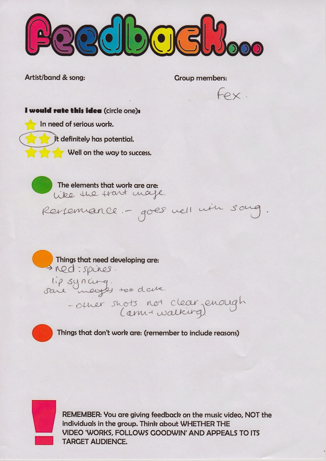
After receiving the feedback for the first music video I changed some bits. I added more scenes and rearranged some footage so that it will be in sync with the lyrics. I also added some scenes of the band outside the studio and added to more scenes to make the narrative clearer.
Tuesday 21 January 2014


Sunday 19 January 2014
MUSIC VIDEO ‡ 1ST DRAFT ‡
This is my first draft for my music video. I haven't added all the effects and I haven't finished filming yet but this is the general idea I want for my music video.
Saturday 18 January 2014
FRONT COVER ‡ FINAL DRAFT ‡

During the feedback in class, Jack pointed out the front cover was a bit flat so I decided to add some stroke effect to both the picture and the name of the band. This made the band name more visible.
Friday 17 January 2014
INNER PANEL ‡ 4 ‡

I decided to change the inner panel from the T shirt promo this because free merch giveaway seamed like something that should be in a small conner in the digipak and not part of the whole panel.
I decided to change it to a picture of the band members but designed it to fit the rest of the digipak designs.
Wednesday 15 January 2014

Tuesday 14 January 2014

Monday 13 January 2014
JOURNAL ENTRY
I decided to take out some of the bloody gore scene from the music video because when I showed my animatics in class, some members of the class said that it was too graphic and gory.
One of my aim is to provoke audience response but the response I got was all negative and it might be too gory for my target audience so I decided to change it.
75% of the music video will be performance scenes because I did some research and found out that, that is a convention of a rock video and mine is a sub-genre under the genre of "rock".
I tried booking a recording studio to film the music video in but was unable to do that, so I decided to do it in my garage instead. That is one of the setting most commonly used in a rock bands. for example, Blink 182, Sum 41, Jimmy Eat The World, A Day To Remember, Silverstein and New Found Glory.
Sunday 12 January 2014

Saturday 11 January 2014

Friday 10 January 2014
INNER PANEL DISCARDED!

This was going to be used as part of my inner panel but after showing it to the teacher and other students, they said that it glorifies suicide and that is something I don't want my video to be associated with.
The picture and the text beside it is not something that should be used for an A level project so I decided to change but still stick to the stereotypical conventions of my genre.
I also changed it to fit something that I call, 'my definition of "emo" genre'

Thursday 9 January 2014

JOURNAL ENTRY
I decided to use the same background through out the digipak because I wanted the digipak to have a similar theme.
However, two of the inner panel did not have the dame background but it fit into the 'emo' theme of the digipak.
I decided that the only pictures on the digipak that clearly shows the band members will be the front cover because I want to communicate to the audience that the band is not about fame but about the message of their song and their fans.
I also decided that I wouldn't be the lead singer in the music video because I was working alone and band members that I used has no experience with camera work. It will be difficult to feature and film the video at the same time. I decided to make the lead singer a guy because when I played the original song in class, other members of the class assumed the singer was male and they said that the singer sounds male. So I decided to play on that assumption and use it to my benefit.
CD DESIGNS


These 3 designs fit perfectly with the new idea for my digipak because they are all in a grunge style.
I decided to chose the middle one because it was more of a fit and the font and the grunge design was a perfect mach.
I also printed them out and showed to the people I felt were my target audience and 95%of them chose the middle CD design.
Wednesday 8 January 2014
JOURNAL ENTRY
I decided to change my Digipak at the last minute because I felt that the way I decided to design my Digipak before was not very conventional to my chosen genre as I wanted it to. The new design followed all the codes and conventions strictly and I used this lesson to design it.
The digipak will not be in a story form but just have a theme that is conventional to my chosen genre across it
Tuesday 7 January 2014
POSTER ANALYSIS OF A BAND SIMILAR TO MINE
I chose this poster because because it is similar to what I want to do with mine. The picture of the all the band member is important for my poster because my band is an upcoming band. The choice of costume and font is also going to be of my major focus when making my poster because it will help my target audience recognise the genre of music my band plays.
The costume worn by the band members of Black Veil Brides makes them easily recognisable by their target audience and that is why I chose this particular poster.
Another reason I chose this poster is because it has the name of the band boldly written at the top. The front cover of the album is shown in the poster to indicate that the poster is a mean of advertising their new album. That will also be one of my major focus when creating my poster.
The poster will be gotten free if the album is bought and that will make the target audience want to buy their album. This is a means of marketing that I want to add to my poster.
Subscribe to:
Posts (Atom)